Dashboard
The dashboard displays an overview of the core usage of metrics within your Hadoop ecosystem.
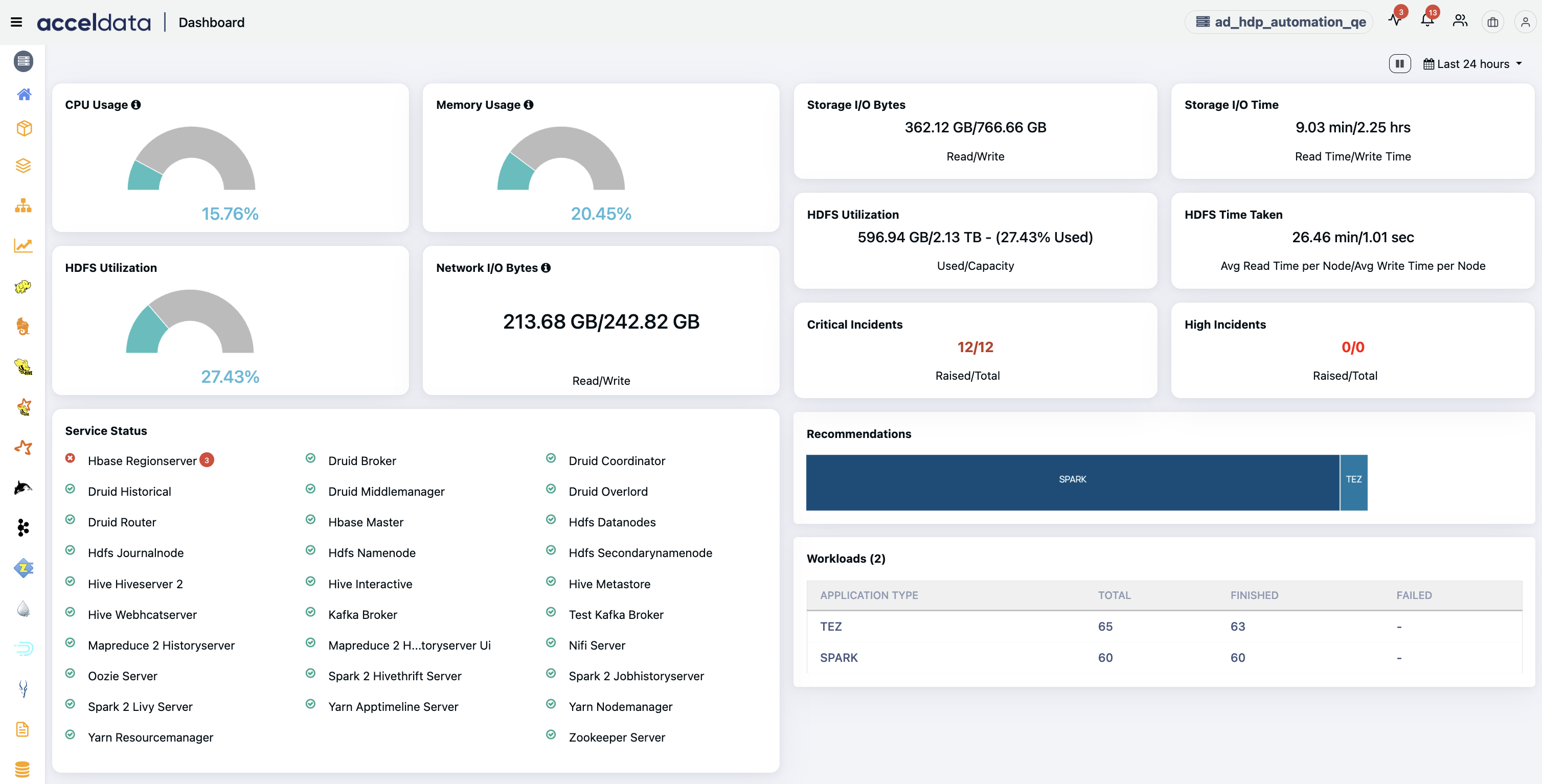
The following metric tiles are displayed.
Metric | Description |
|---|---|
CPU Usage | The amount of CPU utilized (in %). |
Memory Usage | The amount of memory utilized (in %). |
HDFS Utilization | The used and total HDFS (DFS + Non-DFS) storage capacity, along with the percentage of storage used. |
Network I/O Bytes | The amount of incoming and outgoing traffic rate (read/write in bytes). |
Service Status | The current status of services attached to the cluster. |
Storage I/O Bytes | The average of total bytes read from and written to disk across all hosts for the selected date range, with read and write operations calculated separately. |
Storage I/O Time | The average of total time spent (in ms) reading from and writing to disk across all the hosts for the selected date range, with read and write operations calculated separately. |
HDFS Data | The amount of HDFS data utilized. |
HDFS Time Taken | The average time taken for reading and writing to the HDFS storage per datanode for the selected date range, with read and write operations calculated separately. |
Critical Incidents | The number of active and raised critical incidents. |
High Incidents | The number of active and raised highly critical incidents. |
Workloads | The number of currently active workloads in applications. |
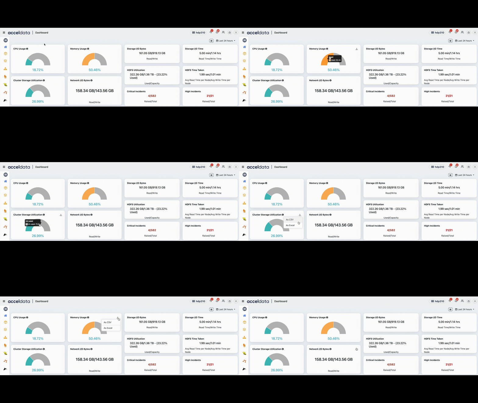
Download Visualization Data
You can click the download button on any of the visualization to download the visualization data. You can choose to download the data in CSV or Excel formats.
Recommendations
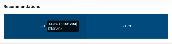
Based on the usage of clusters installed in your ecosystem and the jobs you submit for every application type, Pulse gives you recommendations on the Dashboard screen. Click the application name in the tile to view the recommendations.
As an example, the following image displays Spark and YARN recommendations. Hovering over the Spark recommendation displays the percentage and the number of currently running jobs.
Note
Clicking any recommendation redirects you to the Recommendations page for a detailed overview.
Pulse Ribbon
The Pulse header ribbon on the top right corner of the home page displays buttons and icons for easy navigation and quick, actionable information.
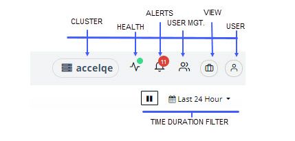
The Pulse ribbon contains the following buttons, from left to right:
Cluster - It displays the name of the cluster. In the example, accelqe is the cluster name. To know more about clusters and how they work when multiple clusters are added, see Clusters.
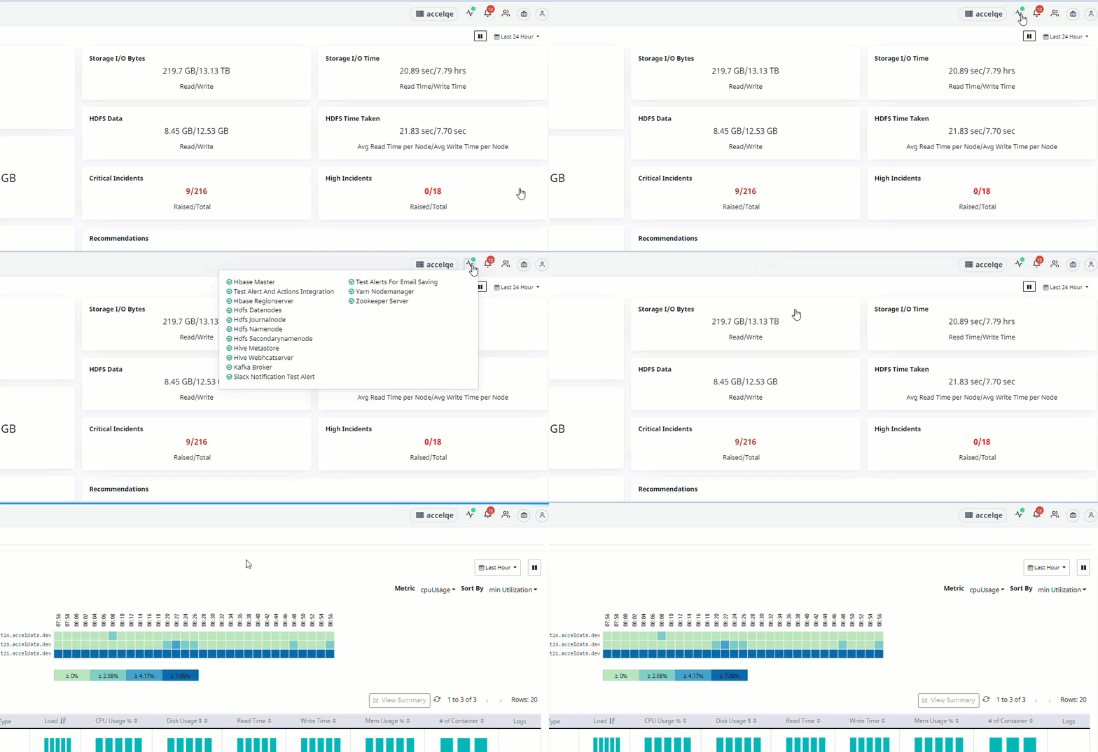
Health - It displays the health of the services running on a node. The green dot on the top right of the icon indicates that all the services are working at expected levels. Change in the dot color from green to amber or red indicates that one or more services is down on that node. Click on the icon to view the services impacted. Click on the service to view the details. It is demonstrated in the following example.
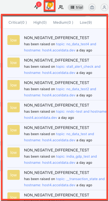
Alerts - Alerts display incident messages about clusters in your Hadoop ecosystem that may need attention depending upon the severity levels such as Critical, High, Medium and Low. Click the button for detailed incident notifications raised as shown in the following image. To manage alerts and associated incident messages, see Incidents.
User Management - Clicking on the icon directs you to the user management or role based access control. See User Management.
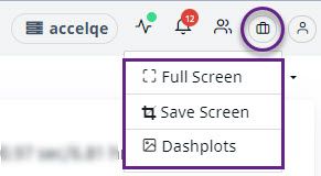
View - The view button provides options to view the dashboard in Full Screen mode, to save the dashboard as a screenshot, or to visualize in the form of Dashplots. To visualize and manage the feature, see Dashplot.
User - The user button contains the product and user-related information.
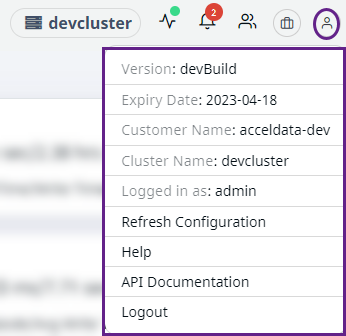
Fields | Description |
|---|---|
Versions | Displays the current version of Pulse. |
Expiry Date | Displays the date of license expiry |
Customer Name | Displays the name of the customer who has been assigned the license. |
Cluster Name | Displays the name of the cluster |
Logged in as | Displays the role that the user has chosen to sign in as. |
Refresh Configuration | Restarts the configurations. For example GraphQL. |
Help | Directs to the Pulse User Guide |
API Documentation | Directs to the Pulse API Documentation |
Logout | Logs out of the Pulse application |
Note
From version 2.1.0 onwards you can access the Help guides and API documentations from the Pulse UI.
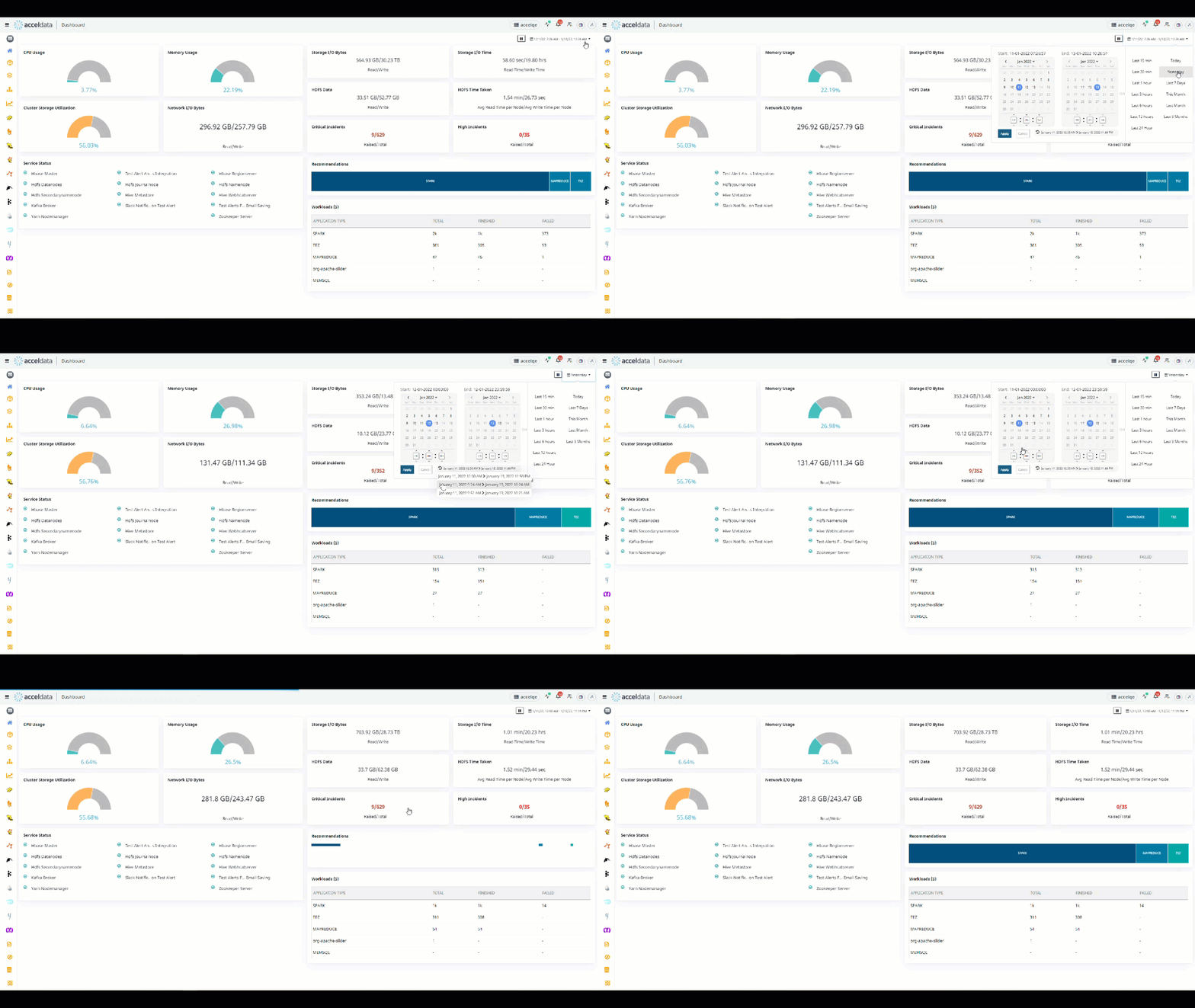
Filtering by Time - You can filter the data in all components or views using the filtering by time button, located at the right corner of the page.
Pulse lets you display recent past metric data or all-time metric data with the Duration option. The duration can range from the Last 15 mins to the Last 3 Months.
The following demonstration shows the functioning of the filter by time durations.