
Create Custom Visualization
Pulse provides a wide range of ClickHouse metrics that you can use to create custom visualizations and dashboards tailored to your operational and performance needs.
Steps
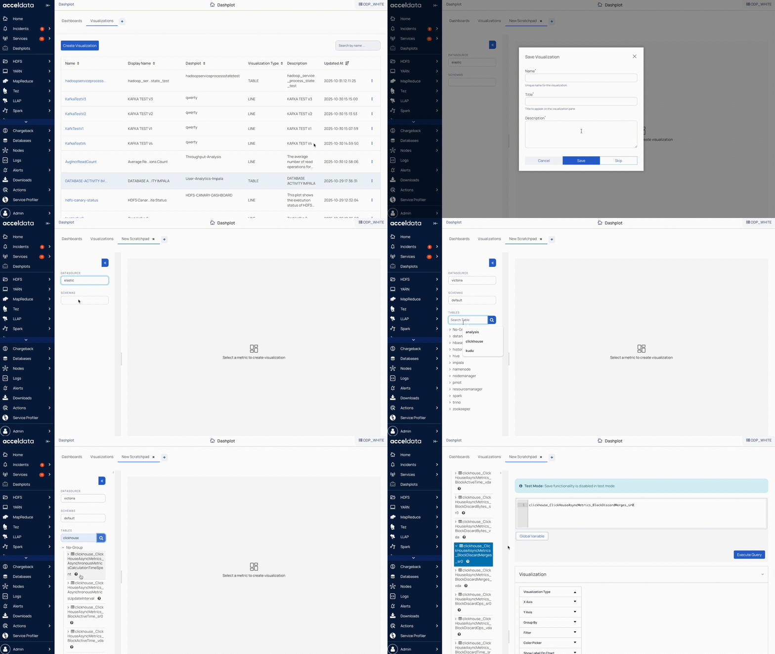
- In the Pulse UI, go to Admin > Dashplot Studio.
- Click + to create a new visualization or
- Or, select Add Visualization in the Visualization tab.
- Enter the visualization name, title, description, and Save.
- Set the Datasource:
- VictoriaMetrics: for time-series metrics
- Elasticsearch: for log-level metrics
- MongoDB: for metadata and configuration data
- Select the Schema.
- Search for ClickHouse in Tables and select a metric.
- Modify the query as needed, then configure chart type, filters, and groupings.
- Save your visualization and add it to a dashboard.
For detailed information about creating custom visualizations and adding to dashboards, see Dashplot.