Dashplot: Custom Dashboards
Dashplots enables you to create custom visualizations and dashboards for monitoring operational, infrastructure, application, and business metrics across xObserve environments.
Dashplots provides a flexible query-driven visualization framework that allows users to build charts, organize them into dashboards, configure filters and variables, and share insights across teams.
Using Dashplots, you can:
- Create custom visualizations from supported data sources.
- Build dashboards using one or more visualizations.
- Configure dashboard interactions and drilldowns.
- Use variables to create dynamic and reusable queries.
- Schedule and distribute dashboard reports.
- Monitor metrics through multiple chart types and visualization options.
Navigation
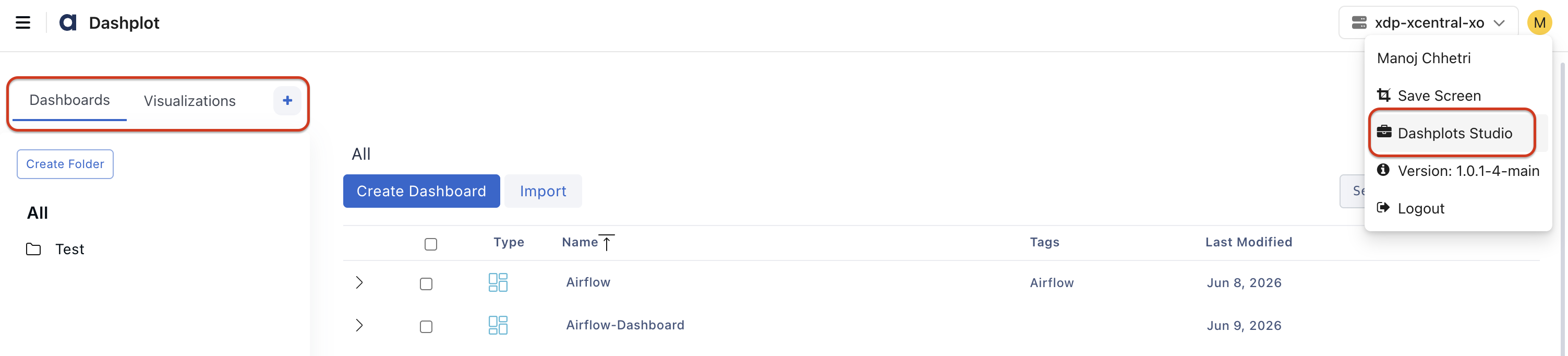
- In the xObserve UI, go to the user icon in the top-right corner.
- Navigate to Dashplots Studio from the user menu.
- The Dashplots workspace opens with the following tabs:
- Dashboards
- Visualizations
- +, to Create New Visualizations